So when we last left off, the adverbs were winning. Through the MAGIC OF DATA, I determined that 4.9% was the correct adverb rate for fiction, and my tripe was heavy with 6.9%. It actually turns out to be more like 7%, with some hyphens, ellipses, and possessives that I failed to account for the last time around, but the point stands.
Okay. I need to cull about 2% of my words or over 1800 adverbs.
Crickets.
I need a plan of attack.
Now in an ideal circumstance, I would remove the superfluous ones. But that means I must somehow assign a value to them. And this concept is offensive, lexicologically, deontologically, and third -ology meaning the study of data. Dataology. No, that’s stupid. Plerophorology? You’ve gotta be kidding me!
Also, from a more practical standpoint, if I knew what adverbs were superfluous in the first place, I wouldn’t be in this mess now, hmmm?
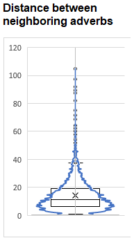
So my plan was to identify local clumps of adverbs and thin their ranks. The average distance between adverbs was 14.2 words, with a standard deviation of about 10.9, so you can see it is skewed.
Removing the clumpiest 30% (what I would need to get my adverb rate to 4.9%) would see all adverbs that were within 7.5 words of a neighbor stricken from the record.
But there are several problems with that approach. First off, a word is either 7, OR 8 words away from a neighbor. 7.5 is a useless threshold in integer items. SO I could flip a coin on every word that is precisely 7 away from a neighbor to see it stays or goes, but I thought I could do better than that.
What if I were to calculate a running adverb rate, and remove the ones where the rate shot up the 30th percentile of the highest?
That was dumb. First, it was always going to asymptotically drive to the overall average, meaning that the average would always be either over or underthreshold. Someone mathier than me must tell me why my 30th percentile cutoff (6.9%) seems near the final adverb rate. Perhaps I have inadvertently rediscovered the golden ratio.
I considered a moving average, but the crux with that is of course, the size of the moving frame. Everything I Googled on how to choose an optimum moving average frame was all stock trading stuff, and they like their frames in quarters of the year, which is supremely unhelpful to me.
But then, I had an epiphany. If adverbs are repellant, why not use the concept of magnetic repulsion to remove the ones that were most repulsed out?
If you imagined the adverbs are all electrons with negative charges, the ones in the clumps would repel each other the most. But instead of pushing them away, I just push them out.

This is a lot simpler than it looks because the top is equal to 1 in my case because all adverbs are equally repellent (remember, I can’t pick which ones to discard). I’m not sure what to make of the permeability of the medium of words; the metaphor is rather escaping us there, so we’re going to pretend that part doesn’t exist.
The bottom part of the equation is trickier. The repulsion or magnetic forces decreases with the inverse of the surface area of a sphere because this phenomenon was measured in a universe with three spatial dimensions. The line of words in a book can be considered one spatial dimension, so the repulsion of adverbs is simply the inverse of the distance between them.

So I simply take that list of adverbs, the absolute position of each one, and sum up the inverses of its distance to all the other adverbs to get its total repulsion. Then, I can remove the highest 30% of repulsion figures.
Because I was lazy and using Excel for all of this, this meant constructing a spreadsheet with 6074 columns and rows, all cranking out these figures. That’s 36,893,476 calculating cells in a single worksheet. Needless to say, I deleted it as soon as I was able to copy all the sums.
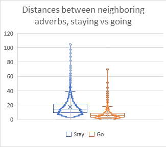
This seems a little bit better than just taking the bottom 30% of the previous plot. I’m hoping the overlap might leave it a little less stilted.
Now then, of course, the actual implementation may be another matter, not to mention an extra problem I found while doing this analysis, which I’ve decided to spin out into its own post.
0 Comments