So when I decided that Sandra, my upcoming heroine, would grace the cover, in her human instead of her Phoenix form, which would be more genre appropriate, I knew it would be contentious. But at least I didn’t get a lot of booing or anything like that. I got a lot of critique which I believe was genuinely attempting to be constructive, which I really appreciated. But my gestalt was that it fell into two very opposite camps: “Thank you for having someone that looks like me on the cover”, or “What’s wrong with her shoulders?”
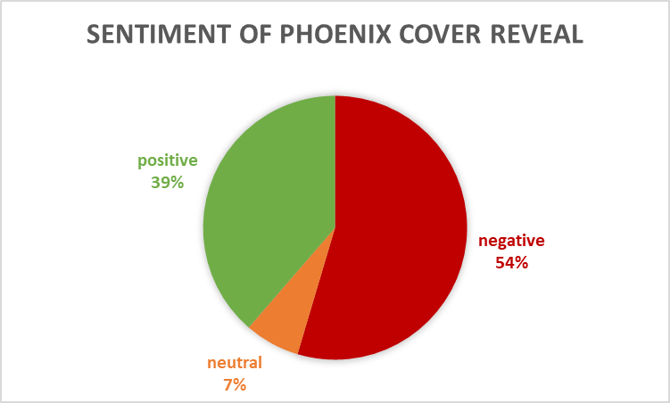
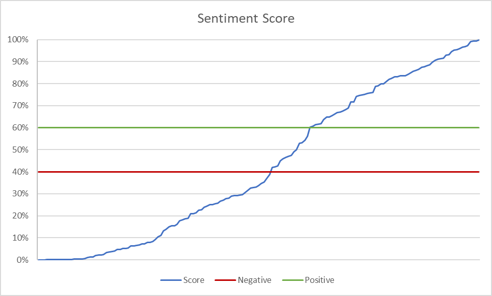
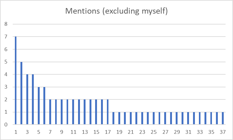
So I solved this problem like I do all my problems – with data. 2 days after my reveal, I had 163 responses (22 of them my own in response to others) across the three places on Facebook that I posted. I used the Azure Add-in for Excel for sentiment analysis.

You can see that the responses trended to negative. The average score was about 42%, which is neutral, almost negative.


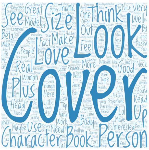
Before we get carried away here, I’m pretty sure the “Size” most critiquers were noting was that of her head, which is the second largest word.
I plan to take these analyses to my artist and figure out if these are actionable or not.
I thogh am quite happy with the art as is, and don’t plan to make any drastic revisions.
0 Comments